January 27, 2012

The Double Thunderbolt

Alex, I found your dinosaur! Green on a yellow background! Well, I hope at least it's the one you meant. (For those who haven't got a clue what I'm on about, see here.)


I must admit it will probably only appeal if linked to some childhood memory, but that's fine, I have stamps like that as well, which I will maybe show someday.

But seeing that Mongolia was named twice in our ongoing (as in: come on, say which country you think issues the most beautiful stamps) forum thread, which could be considered highly unusual, I thought I'd better delve into a Mongolian catalogue and see what the attraction is supposed to be.

And I must say I didn't have to search for long. Better still: I was hooked as soon as I saw Mongolia's first set, issued in 1924! So I got some in and will show them to you today.

 
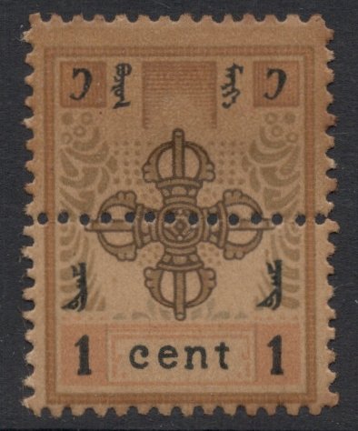
The main design is the same for all seven values. It depicts a Buddhist symbol called the vishvavajra, or the Double Thunderbolt. I'm not too well-informed but if I understand it correctly, the centre is the God of Lightning, who speaks eternal truth, and the four arms if you like are his thunderbolts, or tongues (speaking wisdom). The word vajra (thunderbolt) also means diamond and is representative of the rock hard (i.e. indestructable) and endurable state of Buddhahood.

Now, be all that as it may, it is very much an indigenous design (probably more so than dinosaurs!), and therefore very appealing. And each design has a slightly different background. And also, and I quite like this, even though it's a monstrosity to mount, each value has its own size, so the higher the value, the larger the stamp!


There are of course the usual varieties to collect, imperfs, double prints, and so on, although most are discarded as printer's waste. The only official variety really is the two types of perforation: 13.5 or 10. 

And then there's the strange case of the horizontal line of perforations through the middle! Well, apparently these stamps were meant for export and not postally valid, although some of them have again apparently been used.


All in all I must say that my first acquaintance with Mongolia was very positive and it goes to show once again that you should never write off or slack anything before you know what you're talking about. Or after, for that matter, for if even brightly coloured dinosaurs have their attraction to some, then who are we to judge.

See yous later!
Adrian

January 20, 2012

Peacemaking

Can one build up a thematic collection with stamps only? I'm not sure, but it sure is my 2012 New Year's Resolution! My readers of old may remember that I used to have a thematic collection called 'Peacemaking'. It was quite an extensive thing, with not just stamps and covers included, but also postcards, cinderellas, and even press photographs and correspondence. It basically dealt with the aftermath of the 1919 Paris Peace Conference, and was based on the book Peacemakers by Margaret MacMillan.

Peace Congress Postmark

I worked on it in two ways. First of all, I started at the beginning of the book and tried to find (philatelic) items to illustrate the actual text in the book. But me being someone who likes to take on too much, I also worked on the book from the Index point of view, so that I could be looking at different subjects in one go. Anyway, it became more of an historical document than a philatelic collection. And because I'm really a stamp collector at heart, I always felt a slight pang when I had to fork out money for non-stamp items. And so, at the end of last year, I gave up completely.

But I liked the subject very much and I'm very interested in the historic placement of stamps if you like. So I've decided to give it another go, but in a less extensive manner. I've let go of all non-stamp material, and I've given up working from word one on page one. What I'll try and do is just work from the book's index and see what I can achieve.

Which is why I started off with the Aland Islands. Not the most obvious of topics, you would think, but I still managed to make two pages. You see, one of the results of the Peace Conference was the foundation of the League of Nations. And one of the first cases brought before the League of Nations was that of the Aland Crisis.

The Aland Islands historically belonged to Sweden, but they ceded the islands, as part of a bigger deal, to Russia in 1809. When, later, Finland became independent, it took along with them the Aland Islands, which therefore became Finnish. But the population was still very much Swedish at heart and the large majority of islanders wanted to be part of Sweden again. But Finland wouldn't have that and was only prepared to grant them local autonomy. And Sweden couldn't be bothered either. So it was this predicament that the League had to deal with.

The end result was a decision that the islands would remain under Finnish rule but that a special treaty would guarantee their language and culture.

League of Nations meeting discussing the Aland Crisis

Now the actual League meeting is depicted on  an Aland stamp, so that's a good one.

50th Anniversary of Aland Autonomy

And seeing that the treaty reiterated the desired autonomous state for the islands, the two issues marking that autonomous state will also be finding a place in my collection.

75th Anniversary of Aland Autonomy

So it's not a bad start, I would say! I'll keep you informed on how I'm getting on when I move on to Abdullah!

See yous later!
Adrian

January 13, 2012

The Real Thing

For a few years now, the Dutch Post has marked "Stamp Day" with a special issue. As a collector of Queen Wilhelmina stamps that has made me very happy, for the issues have so far all centred around her stamps. And some of them consist of images of rare material. In 2009, for example, the stamp included an image of an approved colour proof of the 1905 10 guilder high value, the key value of the set and probably of the whole period. 


And the stamp issued just last year is even better, I think. It included a picture of an early stage in the design phase of what was to become the 1948 Hartz series, named after its designer. You can see a picture of the eventual stamp on a former blog post here.


The fact that Enschedé, who printed all the original stamps, seems to have managed to hang on to almost all of its proof material, means that such items will never be part of anyone's collection, and these new stamps are the only way to include them.

So far, I had only been able to find proof material for stamps issued in the colonies, which is much more readily available. The 19 colour proofs for the Dutch Indies 1892 set, for example, do get offered from time to time, and I'm well on my way to complete that set.


So you can imagine my utter amazement and joy when I suddenly saw this rare item up for grabs at auction.


It forms a vital link in the history of the 1923 Silver Jubilee set. The recess-printed set was to have consisted of two values only, as a proper commemorative issue. It was subsequently decided to enlarge the set to eleven values, including three high value stamps. Enschedé could still cope with that, but when it was then decided to change the commemorative set into an emergency definitive set (the existing set had been forged too often, and a new set wasn't ready yet), Enschedé panicked. No way could it produce masses of recess-printed stamps at such short notice.

That's why the company decided to make proofs of stamps printed in lithography, of which this is one. The proofs were rejected though, and Enschedé had no option but to go all out to produce the stamps in the time-consuming method of recess-printing.

Needless to say, I had to have it and I succeeded! Yes! So I'm now the proud owner of this lovely item and a depleted stamp budget. Which is fine, if it wasn't for the fact that its accompaniment, on pinkish rather than greyish paper, is now also up for grabs...

See yous later!
Adrian

January 06, 2012

Canadian Beauties

There are those who still think definitives are boring. I suppose they have rows of identical stamps in mind, in a small format, with only the colour changing for each value. And even then I don't agree with them! But be that as it may, you can't really argue with the fact that Canada issues the most beautiful high value definitives you've ever seen. I was therefore very happy when Carmen mentioned them in the ongoing forum thread on which country issues the most beautiful stamps.

Blue whale

The $10 Blue Whale is indeed a stunner to look at and one in a row of magnificent stamps. The high value definitive series depicting mammals started in 1997, and by now an impressive range of stamps has been issued. One of my favourites of the lot is the one depicting a loon. I've had it for years but took it out again to have another loving look and scan it for this blog post. It was then that I discovered that there is some microprint included which gives you the Latin name for the mammal. Look under the DA of Canada. Or at the dark blue wavy lines on the whale stamp. Once you've spotted them, you wonder how you could ever not have noticed them!

Loon

What I also like very much about these issues is that you get all the necessary info on the sheet margins. They include the name of the printers, of the designer and of the engraver. Perfect! I'm only wondering why there is an "Illustration" mentioned as well. Is the design based upon an existing illustration, maybe?

Moose

The moose margins give even more information. There's a C1 which I suppose is a plate number? There's hooves for all the different printing colours. And there's the mention of petroglyphs and a national park. I had to Google that but it appears that the drawing in the bottom left corner is such a petroglyph. And what's more: if you take out your UV-lamp, you'll find a similar image, but mirrored, hidden in the design somewhere.

So you see, just a handful of definitive stamps yield a world of information and beauty. Well done, Canada!

See yous later!
Adrian